

5. Mai 2026
Anmeldeschluss Sommerfreizeit
Die Anmeldung für die Sommerfreizeit endet am 15. Juni. Jetzt noch Plätze sichern…
Single source of truth for the v3 rebuild design. Every page in the new theme is built from these primitives. Review on mobile and desktop — anything that needs changing should be changed here first, then it cascades everywhere.
Brand orange is set to #CC4400 per the v3 plan. Neutrals shifted from cool grey to warm off-whites and warm dark text — gives a less sterile, more editorial feel.
Single family — Work Sans for everything. Headings use heavier weight (700 for H1, 600 for H2/H3) and tightened letter-spacing to differentiate from body text. Cleaner and less editorial-magazine, more like a calm modern utility.
Lead paragraph — used for page intros under the H1. Slightly larger and lighter than body text, capped at ~60 characters per line for readability.
Fließtext — Der Deutsche Familienverband Landesverband Berlin e. V. bietet Beratung und Unterstützung für Familien in Berlin. Hier sehen Sie, wie ein normaler Absatz im neuen Design aussieht. Inline-Link sieht so aus.
More generous than before — large gaps (lg / xl / xxl) give pages room to breathe, which is half of what makes a layout feel high-end.
--spacing-xs
0.5rem
--spacing-sm
1rem
--spacing-md
1.5rem
--spacing-lg
2.5rem
--spacing-xl
4rem
--spacing-xxl
6rem
Four variants. Primary for the main action; ghost (orange outline) for a less-loud secondary; outline for use on dark imagery; text-link with arrow for tertiary navigation.
For inline messages — calculator warnings, server feedback, info banners. Soft tinted backgrounds with a colored left rail.
Allgemeine Informationen zum Antrag finden Sie in der FAQ.
Sie erhalten in Kürze eine Bestätigungs-E-Mail.
Ohne Buchungsbestätigung kann Ihr Antrag nicht bearbeitet werden.
Die Datei ist zu groß (max. 5 MB) oder hat ein nicht unterstütztes Format.
Borderless, with a soft shadow that intensifies on hover. Card titles use Work Sans 600 with tight tracking.
Die Anmeldung für die Sommerfreizeit endet am 15. Juni. Jetzt noch Plätze sichern…

Ab Mai bieten wir zusätzliche Beratungstermine in der Schuldnerberatung Mitte an.
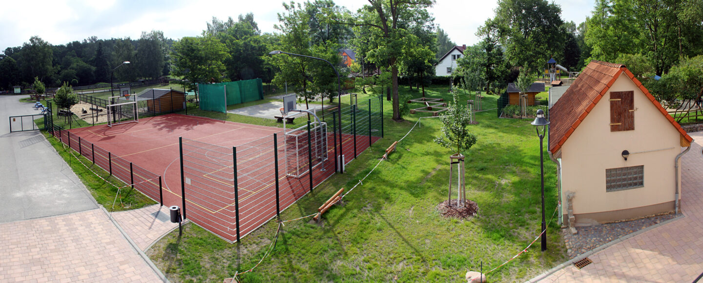
Neue Eltern-Kind-Kurse starten im Juni. Plätze sind begrenzt.
Standard container is 1180px. Wide is 1400px (used for the calculator and full-width pages).
.container · 1180px max
.container--wide · 1400px max
#CC4400 feel right, or pull warmer/cooler?